Data visualization
How to create interactive charts
With Questiory you can create interactive charts for free in minutes: bar, pie, gauge, wheel, and more. The group loads the data in real time. Step-by-step guide.
There are many tools for making charts online. Most of them let you design something visually, load your data, and export a static image.
Questiory works differently. The chart builds itself live, as people respond. You don’t have to load the data yourself. The group enters it, and the chart appears on screen in real time.
It’s free, you don’t need to know anything about design, and in a few minutes you have something ready to share, embed on a page, or print.
What types of charts you can create
When to use it:
- When you want to compare the level or score of several categories at the same time
- To show rankings or voting results in a clear, immediate way
- When you have between 3 and 10 variables and want the differences to be obvious at a glance
- For tracking metrics over time, with one bar per period or group
- When order matters: bar charts make it clear what’s first and what’s last
- To compare results before and after an intervention or training
- When you need the audience to read concrete values, not just proportions
When to use it:
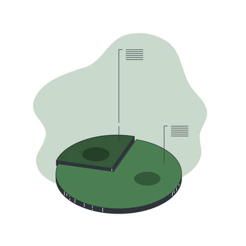
- When you want to show how the total is distributed across a few options, ideally 2 to 6
- To visualize the proportional distribution of a multiple-choice question
- When the question is of the type “how much of the whole does each part represent?”
- When percentages are the important data, not absolute values
- To show the composition of a group: areas, roles, departments, preferences
- When the main message is that one category clearly dominates the others
- For results of quick polls where the outcome is a choice among a few alternatives
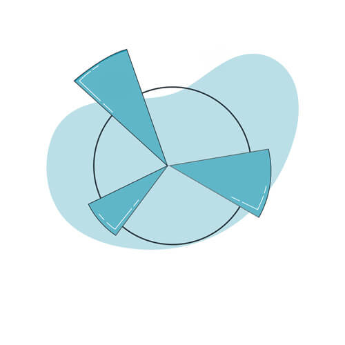
When to use it:
- To show the level or progress of a variable, like a gauge or status indicator
- When you want to communicate how close or far the group is from a concrete goal
- For valuation results where the focus is on one key metric
- When the most important data is a number or percentage the group needs to see at a glance
- To show several indicators in parallel and compare their levels visually
- In contexts of performance tracking, project health, or initiative progress
- When you want a more visual and impactful format than a plain number on screen
When to use it:
- When responses are grouped into categories and you want to see the proportion of each one within the total
- For activities where each person picks an option and you want to visualize where the group leans
- When you have categories with subcategories and want to show the hierarchy visually
- For consensus or voting dynamics where the group’s distribution is the main result
- When you want the group to see clustering patterns in their responses
- For diagnostics where responses are classified into predefined thematic areas
- When a pie chart isn’t enough because there are too many categories and you need to show levels
When to use it:
- When group responses cluster into themes and you want to visualize that grouping dynamically
- For brainstorming activities where ideas are classified into thematic clusters
- When you want the result to be exploratory: let the group see the groupings and interact with them
- For collective mappings where each idea is a node and the category defines the relationship
- When you have many responses and need a visualization that scales well without becoming unreadable
- For synthesis sessions where the facilitator groups ideas in real time in front of the group
- When the value is in seeing which topics concentrate the most responses, not in comparing numerical magnitudes
How to create an interactive chart step by step
1. Create or open a presentation
Log in to your Questiory dashboard and create a new presentation, or open one you already have. A presentation is the container where both the chart and the interaction that captures the data will live.
2. Add a visualization slide
Inside the editor, add a new slide and choose Visualization. This is the slide that will show results to the group. It’s what gets projected on screen and updates in real time as responses come in.
3. Choose the chart type
From the visualization options, choose the chart that best fits your situation: bar, pie, gauge, wheel, or nodes. If you’re not sure which one to pick, bar charts are a good starting point for comparing variables; pie charts work well when you want to show proportional distribution.
4. Choose how you’ll capture the data
When setting up the chart, the editor will ask how you want to capture the data. Choose Valuation.
Valuation is the main interaction for creating charts with numeric data. There are two ways to use it:
- Collaboratively: share the link or QR code with the group, each person enters their values on their own device, and the chart builds in real time from the average of all responses. Useful when the data you want to visualize is the group’s collective opinion or perception.
- Entering the data yourself: open the presentation, load the values directly into the Valuation interaction, and the chart reflects that data instantly. Useful when you already have the numbers and just want a visual way to present them.
When configuring the valuation, define:
- Variables: each variable is a dimension the group will rate, and it will appear as a bar, sector, or axis in the chart. Use between 3 and 5, with labels of 1 to 3 words. With more than 8 or 9, the chart becomes hard to read.
- Min and max: these define the scale range. For opinions, a range of 1 to 5 or 1 to 10 generates more differentiated responses. Use wide ranges only when the data is actual numeric (percentages, amounts, quantities).
- Colors: these are the colors that will appear in the chart for each variable. If some variables represent something positive and others something negative, use colors that reflect that: green for favorable, red or orange for what needs attention.
- Instruction: the slide title is the first thing participants see. An ambiguous instruction generates scattered data that doesn’t reflect what you wanted to measure.
5. Open the presentation and enter the values
Once everything is configured, open the presentation in presentation mode. Participants will see the Valuation slide and will be able to enter their values. As each person responds, the chart updates in real time.
If you’re the one loading the data, for example to show results you already have, simply enter the values yourself in the Valuation interaction.
6. Hide the interaction slide
Once the chart is ready with the data loaded, if you want to show only the chart without the Valuation slide appearing, you can hide it. In the editor, click on the slide and mark it as hidden. That way, when the presentation is active, only the interactive chart will be visible.
7. Share, embed, or print your chart
With the chart ready, you have several options for sharing it:
- Share the link: send the presentation link so anyone can view it on their device
- Embed on a page: use the embed code to insert the chart into a website, e-learning platform, or intranet
- Print: from the presentation, use Ctrl + P (or Cmd + P on Mac) to open the print dialog and save the chart as a PDF or print it directly
Interactive chart examples

Interactive bar chart
Set up your variables, share the link, and visualize the group average in real time.
Collaborative pie chart
Participants choose an option and the result appears as a pie chart in real time.
Collaborative radar chart
Multiple dimensions on a circular axis. The group's collective profile, built live.

Collaborative word cloud
The group's written responses turn into a word cloud in real time.

Collaborative pictogram
Turn numeric data into a visual pictogram built collectively by the group.
If you came here looking for a free online chart maker and were expecting something like Excel, Canva, or Google Charts, Questiory is a different kind of tool. It’s not designed for static visual design. It’s designed for situations where the chart builds itself together with the group, in the moment, or when you want a chart that’s truly interactive.
Create your own interactive charts online for free
Sign up for free on Questiory
Build interactive experiences in minutes.
Get started for free